How to Stage Your House With a Midcentury Modern Design Aesthetic
- Published on
-
Alexandra Christina
This is a guest post by Alexandra Christina from Inmod.com
If you want to give yourself the best chance possible to sell your house, you’ve got to stage it.
In their July 2017 Profile of Home Staging, the National Association of Realtors reported that 77% of home buyers find it easier to see themselves living in a home if it’s staged. Additionally, 40% were more compelled to walk through staged houses they saw online rather than empty homes. Top real estate agents have also found a direct relationship between sales price and home staging: staged houses sell for more.
So you need to stage your house, but how do you know which design style will appeal to the most buyers? Don’t worry — one style that seems to connect with buyers is a contemporary, timeless, mid-century modern design aesthetic.
What is midcentury modern design?
Midcentury modern design centers around minimalism and innovation: using the least amount of materials possible to get the most use out of something.
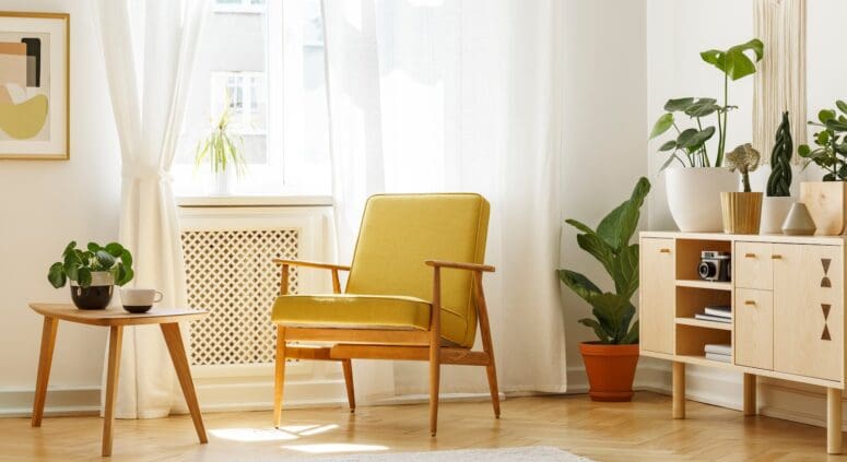
Midcentury modern architecture is characterized by well lit, open spaces with large glass panels and sliding doors that make the space feel lighter and larger. Midcentury modern furniture is designed with the same forward-thinking process as midcentury modern home architecture. It has simple lines and colors and is often made of fused metal and wood or fiberglass.
Spaces designed with a midcentury aesthetic are bright, light, clean and organized.
Midcentury modern architecture uses industrial materials like stucco, steel and aluminum. Furniture is simple, functional, well-made and looks good in practically any setting. What’s even better? This less is more design makes it easy to set up the interior of a space using just a few pieces. You’ll set the scene with attractive and innovative furnishings that will breathe new life into the space.
Ready to get started?
Stage your home the midcentury modern way
Wanchen, a member of the HomeLight team, designed her entire space the midcentury way. We took a page out of Wanchen’s book for our midcentury modern staging inspiration. We’ll take what she did and put together a list of midcentury modern inspired home staging tips for you to put into practice.
Spoiler alert: get ready for some really adorable plants!
If you aren’t sure where to find mid-century modern furniture or even what midcentury modern looks like, inmod.com is a good resource to help you learn more about it.

1. Create Interesting Focal Points
Light fixtures, vases, or potted plants of varying heights create changes in elevation and give the space different depths. Check out a hardware store near you for light fixtures and plants! Stick with one finish on the light fixtures and one color scheme for the plants (varying shades of green is best).

2. DIY for Less
Source furniture pieces and accents yourself. You’d be surprised where the pieces in this photo came from! Did someone say Ikea, Craigslist, and Ross? Seriously. And they look like a million bucks.

3. Make a Statement With a Group of Items
As pictured above, arrange a few potted plants together or create a still life with statement pieces like books, an old record player, or typewriter. These statement groups intentionally draw the eye to different places in the room, while allowing the space to feel sparse and clean at the same time.

4. Pick 1 or 2 Standout Pieces of Furniture
Wanchen chose a bench from the 1960s as a main focal point in her space. Then, she created a tableau on top of the bench. Creating “moments” like this makes it easier for buyers to get a stronger sense of what it would be like to live in your space. Statement furniture also helps strengthen an emotional connection between buyer and house.
Send us pictures of your midcentury modern staged house on Facebook! We’d love to see them.
