How to Decorate the Entrance Door When Selling Your House: 6 Tasteful Ideas
- Published on
-
 Valerie Kalfrin Contributing AuthorClose
 Valerie Kalfrin Contributing Author
Valerie Kalfrin is a multiple award-winning journalist, film and fiction fan, and creative storyteller with a knack for detailed, engaging stories.
In a lived-in home, your entrance door becomes an extension of your individual style, welcoming friends and family with little touches that speak to your personality. But when your home is on the market, you need to redecorate your entry in such a way that beckons buyers to check out what’s on the other side.
Buyers decide within seconds whether they’re interested in a property, in large part because of décor. In fact, 79% of professional home stagers surveyed by the Real Estate Staging Association said that the look of your front door is vital to your home’s overall feel—and can increase its perceived value to potential buyers.
“You are going to see the front door from the moment you pull up,” said Amy Vastardis, a top real estate agent of 21 years in the greater Orlando, Florida, area. “It has to pop.”
Here’s how to decorate your entrance door so buyers want to linger, not look for the nearest exit. (Check out HomeLight’s curb appeal library for even more inspiration and ideas.)

1. Go natural
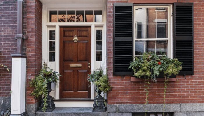
If your front door has ornate decorative panels or rustic embellishments, the door itself makes a statement. In that case, your best front door decoration may be nothing at all.
A steel door with a peephole, on the other hand, tends to look commercial. “There’s no wow factor,” Vastardis said. For doors on the plainer side, you typically can’t go wrong with a little greenery to add interest or a touch of floral. Aim for something understated such as a magnolia wreath, bouquet of lavender, or eucalyptus, fern, and mixed berry combo.
Note: Fake plants and wreaths are typically fine (Nearly Natural is a trusted brand in this arena with its 75 years of industry experience, and who wants to deal with dying plants on their door) but the idea of “going natural” with your door decor is that it keeps you from getting too kitschy with your design. Cutesy is a turnoff in most cases for the purposes of selling your home, as is going overboard in the seasonal department.
If you tend to spend too much time in the dollar section of Target eyeing cheap Halloween and spring decor, resist the urge to purchase selections like those moss letters spelling “Joy” around Christmas, or an umbrella of tulips in the spring. A real pumpkin on each side of the door gives a rustic feel and plays to the fall season, but a wheelbarrow of pumpkins may be a bit much. You get the idea.
2. Create contrast
A front door that’s a bright shade is a popular trend. In fact, 77% of professional home stagers surveyed for RESA’s report Front Doors and Selling Your Home said that buyers react positively when they view a house with a colorful front door (interestingly, purple seems to be an exception).
However, just as a colorful door creates contrast with the rest of the exterior, you also want to complement and contrast accessories with the door’s color.
For instance, red flowers flanking a radiant red door like Benjamin Moore’s Caliente on a white or gray house provide welcome splashes of color against the house’s neutral backdrop. But a red wreath or other decoration on that same door will blend in so well, it won’t be seen from the street.
Likewise, a forest green decoration against a red door might remind too many buyers of Christmas, even in July. A better option might be a white wreath or decoration, complementing the house’s main color but standing out against the red door. (Check out these 10 bedrocks of color theory to help create a harmonious color scheme, along with these floral suggestions to match particular moods.)

3. Add shine with fresh metallics
Hardware and house numbers can pack a sophisticated punch all on their own, such as a black knocker and door handle against an aqua shade like Benjamin Moore’s Blue Spa, or a polished nickel handle against a warm gray door and teamed with slim black house numbers, similar to these digits by Distinctions by Hillman, in these projects via Four Chairs Furniture.
Incidentally, your house numbers should be a good size that’s visible from the street. “Not to where it’s obnoxious, but where people can see it when they’re driving up,” Vastardis said. “I’ve seen some that are so small, you drive right past the house.”
Schlage, a trusted lock and hardware manufacturer since 1920, has a helpful guide on picking the handleset finish that works best with certain hues. For instance, bright chrome and satin chrome provide an edgy look that pairs perfectly with cool blues. Aged bronze stands out best against fiery red and orange tones. Going green? Opt for a finish like matte black against lime and similar shades.
If you don’t have the time or inclination to shop for new hardware, you also can paint yours a more striking hue, such as this DIY-er who ditched brass on a budget by spray-painting doorknobs with Krylon ColorMaster Satin Oil-Rubbed Bronze Metallic Spray Paint ($4.59).
4. Use symmetry
A symmetrical composition is naturally pleasing to the eye, according to Better Homes Gardens. If you have room for one planter, such as this H Stone Scroll Band Urn in Aged Ivory Finish or this White Grecian Plastic Urn Pedestal Planter, get a second to flank the other side of the door with identical plants.
Along the same lines, one wall sconce looks lonely. Purchase a second to make a pair and a more inviting entryway. Try the modern coastal design of the Globe Electric Turner Black Medium Base Outdoor Wall Light, the Kichler Barrington Distressed Black and Wood Tone Outdoor Wall Light, or the Bay Crest 1-Light Outdoor Sconce.
5. Honor your home’s style
Even if you’re not an architect, you can probably tell when something looks out of sorts with a certain architectural style. Your house likely has a dominant style suited to a particular region of the country—such as Colonial and Cape Cod-styles in northeastern neighborhoods, or Craftsman bungalows and Greek Revival homes in the South.
Choose front door decor that augments your home’s style. There’s no need to deck out the entry of your quaint English-style cottage as if you’re at the beach unless you’re in a seaside community. A brushed-steel planter won’t look right against the stucco or adobe facade of Spanish architecture, but a wrought-iron planter such as this one from Achla Designs would, filled with cascading ivy or succulents such as a crown of thorns.

6. Think mass appeal
Nothing personal against your decorating style. Just remember that at this stage to avoid anything with your family’s last name or initial. “It goes back to the same thing where you don’t want personal pictures in the house because it takes people out of visualizing themselves living there,” Vastardis said. “We want people to feel like this could be their home.”
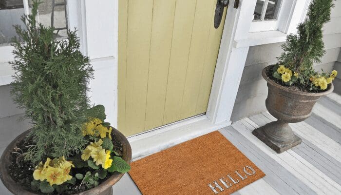
You can certainly help buyers feel welcome with a doormat that indulges your creative side, such as this rustic DIY wood-slat version.
Once you’ve decorated your front entry just right for showings, why not take note of whatever changes you’ve liked? You just might want to carry over some of this inspiration to your new home.
Header Image Source: (littlenySTOCK/ Shutterstock)